 "Slice
Of Life"
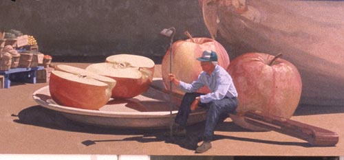
will be a
step-by-step of how I approach a watercolor. I've
taken a detail from an older oil painting,
showing a farmer, sitting on a knife that is
resting on a plate of apples.
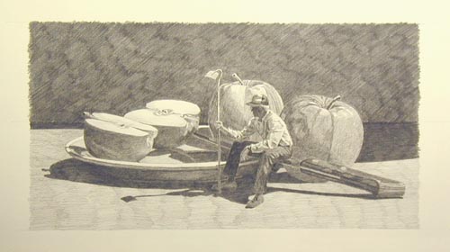
I've
rendered the image in pencil on paper, drawing it
to the same size as the intended watercolor.
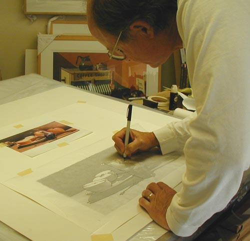
Having
taped a sheet of tracing paper over the drawing,
I'm tracing the outline of the image with a thin
black marker.
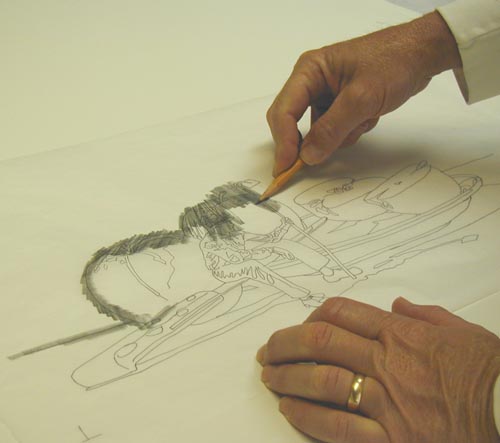
Now,
with a No. 2 pencil, I'm rubbing the graphite
onto the back of the tracing paper in the area of
the marker outline. The tracing paper now becomes
carbon paper.
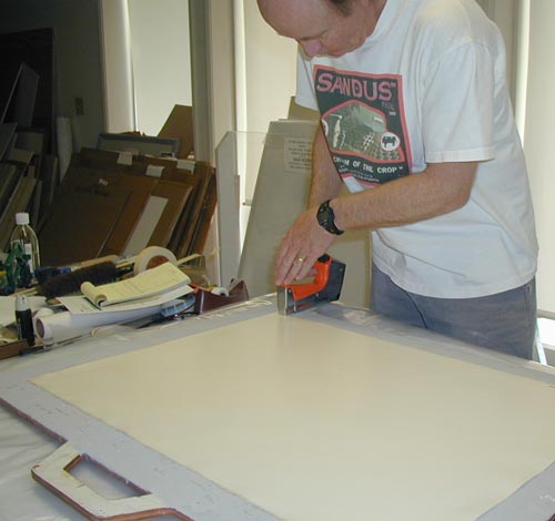
Next
I've taken Arches 140# cold pressed paper and
soaked it in the tub for 30 minutes. After laying
it out flat on a 1/2" plywood board, I
staple it securely around the edges and let the
paper dry thoroughly.
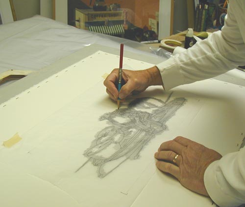
My
next step is to position the tracing paper on top
of the 'dry' watercolor paper and tape it into
position. I then retrace the marker lines with a
6H pencil, transfering the drawing's outline onto
the watercolor paper.
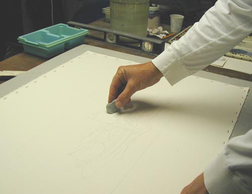
With
a kneaded eraser, I lift any smudges and lines
that are too dark.
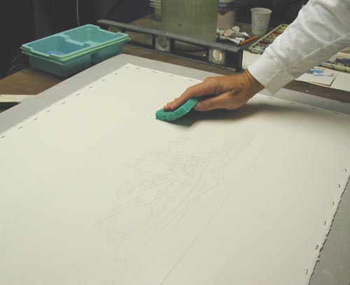
When
I'm satisfied with the outline, I take a kitchen
sponge (dedicated to this watercolor preparation
step), and dip it in clean water. I wipe the
surface down gently, twice from top to bottom and
twice from side to side. I then let the paper dry
completely.
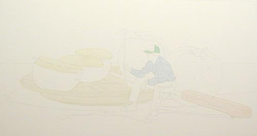
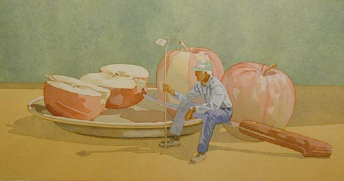
To
begin the painting, I look at every object and
paint it's highlight value over the entire
object. What is a highlight value? If you think
of an object that is being hit by sunlight from
360 degrees, (Impossible, but it helps me explain
this painting step.) you wouldn't have any
shadows, just highlight colors. That's the hue
and value that I mix for each item. In the photo
above, you see that I've begun putting in the
highlight values (top of the cut apples, the
plate, the man's shirt and hat and the knife
handle).
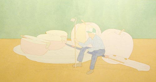
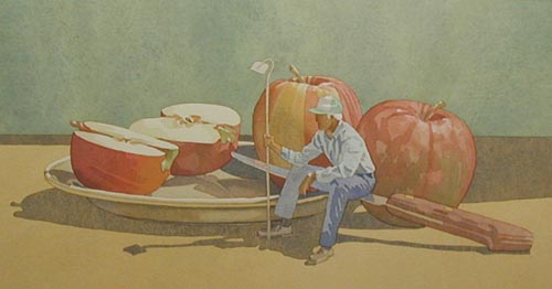
Here is
the painting with every object painted its
highlight value. I know I am ready for the next
step when I look at the painting and see if I can
find any 'white' paper. The only white paper
showing in this painting is on the front of his
hat and his hair. Those are actual 'white
objects', looking the way they would if the sun
was hitting them.
Here I am
applying the 'second step' or the 'shadow wash'.
I mix up ultramarine blue and burnt sienna into a
gray wash and then apply it everywhere that the
direct sunlight doesn't hit.
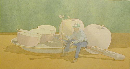
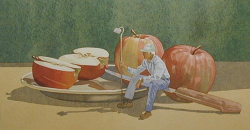
Here's
the result! If you compare this photo to the
image two photos up, you'll see that this is
really a unifying wash for the painting. It
defines the light source, and guarantees that now
the only white paper showing is of white objects
in direct sunlight. In this painting that would
be the two chunks of white on the farmer's hat.
From this point, I will begin putting the subtle
details in the highlight areas and in the shadow
areas. These details will be a combination of
grays and color, giving more definition and
interest in the objects.
I've
increased the color and detail in all areas of
the image. The cohesive blanket of the 'gray
wash' has started to diminish as it is being
broken up with all the 'detailed' small washes.
As soon as I am satisfied with the detailing of
the objects, I will go back and lay down another
gray wash to subdue these hard shapes.
I've
increased the color on the apples and most of the
cast shadows. The cast shadows have a darker
value than most of the shaded areas of the
objects so that is why I strengthen them. Also,
by darkening the shadows, it tells me more to
increase the color and value of the objects in
the painting. I will keep adding color to the
objects until I feel I can reach the end of the
painting with one more gray 'blanketing wash'.
I've put
more color in the back wall and increased it in
the apples. I've purposely avoided darkening the
farmer since he overlaps areas that will be
lighter than him. If I had darkened his trousers,
the shaded area of his shirt, and the knive
blade, the edges of those areas would bleed into
the lighter washes that have been painted up
against them. I'll now apply the final gray
washes on the apples' shaded areas, muting some
of the color and bringing out the contrast
necessary to show the light source again.
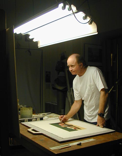
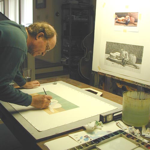
I work on
a flat table, facing my drawing that I've put on
an easel. I use two sets of double 4' flourescent
lights overhead, slanting the light fixture that
is closest to me away from me to reduce the glare
on my eyes. I've alternated the flourescent tubes
with warm and cool varieties. Notice the level by
my water container. I make sure that the table
and watercolor board are level, making it easier
to lay smooth pools of watercolor washes.
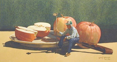
Here is
the completed painting. The wide range of values
helps make the light convincing. Notice the
texture of the back wall from the granulative
nature of the ultramarine blue pigment. Hope you
enjoyed "Slice Of Life".
|