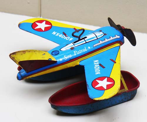
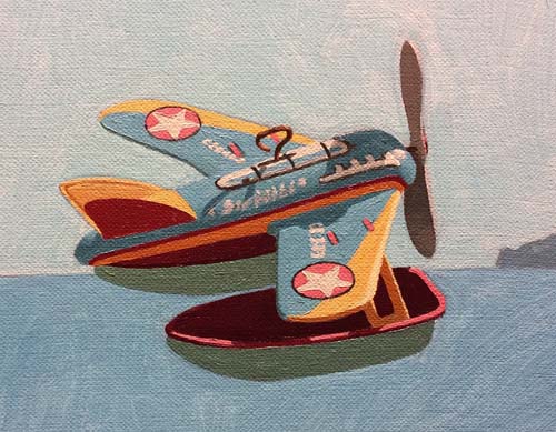
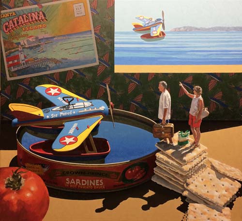
I purchased this 1950's tin toy seaplane many years ago with the
intention of using it in a painting. Well, it finally
inspired me with a fun image. As a kid, I was facinated by
the seaplanes that brough visitors over to Catalina island.
So, this little "Sea Patrol" toy will be the focus of my next
painting.
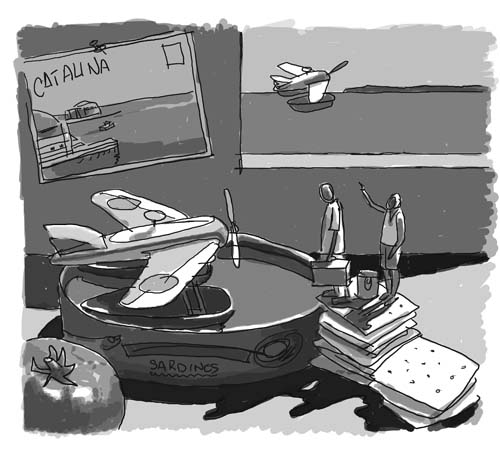
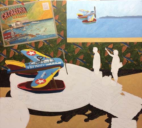
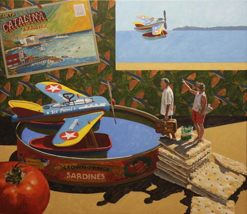
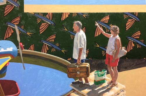
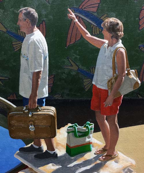
My sketch above shows a couple, having made their way up the
saltine cracker steps, waiting to board the plane to Avalon.
The woman points to another seaplane taking off and heading to
the island. Their plane sits in a sardine can that once
contained sardines in a hot tomato sauce. On the wall is a
vintage post card of Catalina.
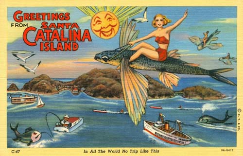
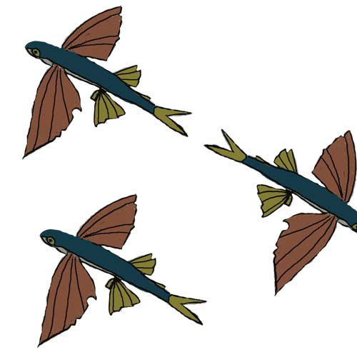
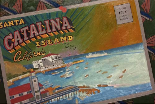
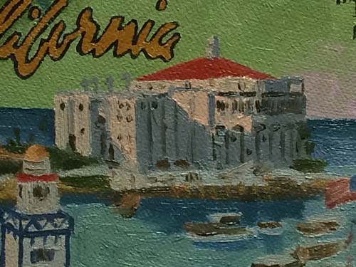
As you can see with this old postcard, flying fish were popular
a long time ago and sparked the creativity of artists.
This postcard will be the one I'll use on the back wall of my
painting.
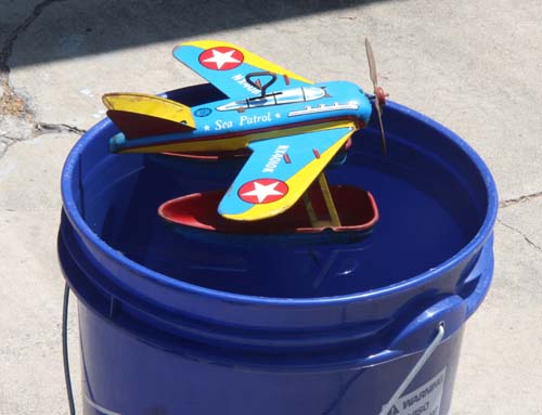
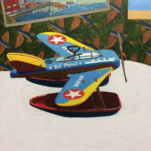
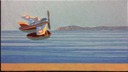
I've put the plane in a bucket of water to see what it looks
like, floating in the sunlight.
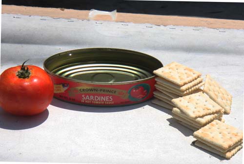
I'll position the sardine can, the tomato and the crackers to
fit my design. I'll take a photo of this to have something
precise to draw and paint from.
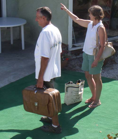
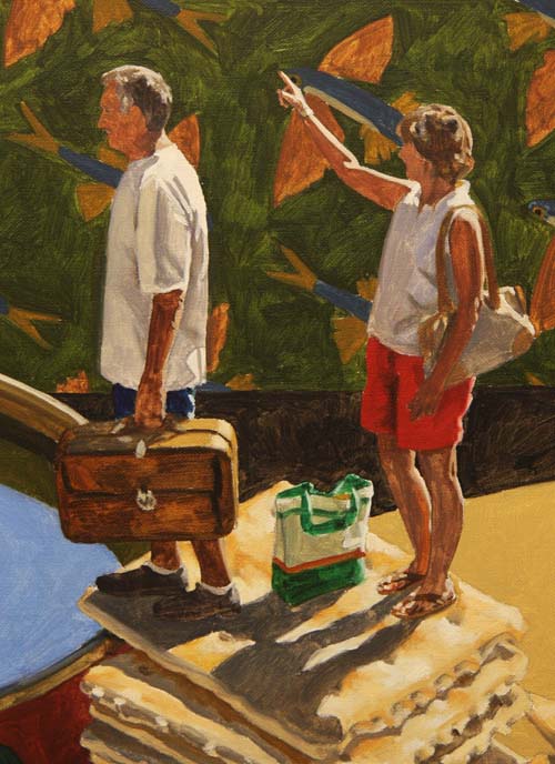
My buddy, Rick, and his wife Cindy are my models for this
painting.
When I first traveled to Catalina with my sister and grandmother
in the middle 1950's, one of my distinct memories of the trip
was watching the flying fish. As the ship cut through the
ocean, you could see the flying fish break the surface and fly
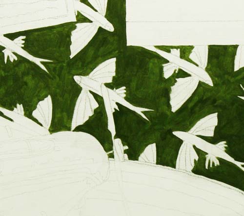
through the air just above the water. I've decided to
design a flying fish wallpaper motif for the back wall of the
painting. I've started the painting on the wall, mainly
because its dark surface will tell me how dark the other values
of the painting need to be. I've decided to name this painting,
"Flying Fish",
not just for the fish, but for the seaplanes that flew above the
water.
Here is my wallpaper design that I will put on the back wall.
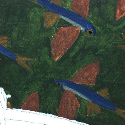
I've roughed in the wallpaper with thin washes of oil. I
used Winsor (thalo) blue, black and white to create the blue
body of the fish. Burnt sienna, alizaron crimson, black
and white for the main 'wings' and burnt umber, cadmium yellow,
and black for the tail and the rear fins. The light
underbelly of the fish is a thalo blue, burnt sienna and white
mixture.
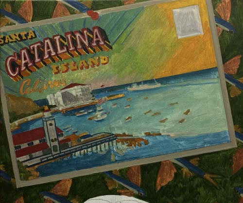
The postcark is roughed in. There are a lot of fine
details to be put in later.
The view out the window is now finished in its first stage.
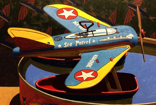
Here is the seaplane, painted with its thin wash of oil.
The cast shadows and the ground have been painted. This
helped me delineate the edges of some of my drawing.
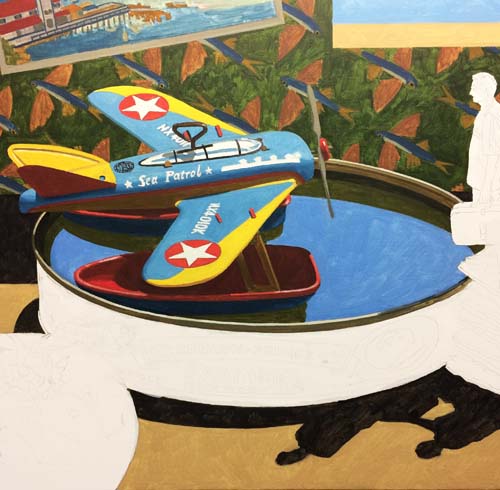
The water in the sardine can with its reflections is now painted
in. I painted the blue of the water with a little more
French ultramarine blue than the ocean out the window. The
warmer blue shows that it is closer to the viewer. Also,
in reality, there would be some reflection of the wall in the
background in the water also, but I chose to leave it out to
help simplify the area around the seaplane.
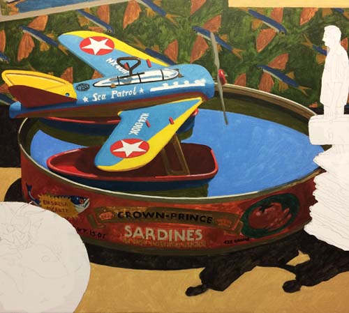
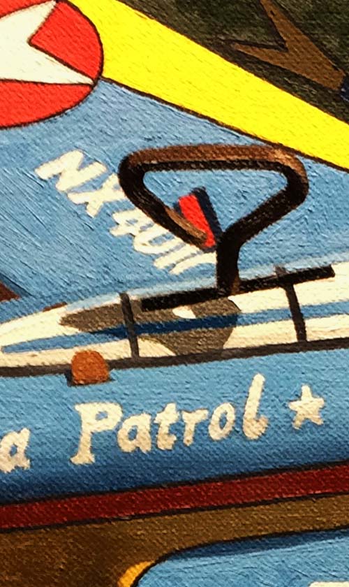
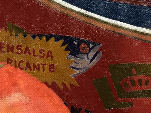
Here is a photo of the sardine can label painted in. You
can see that it is very thinly painted at this point.
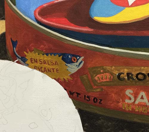
This close-up of the sardine can label gives you a better idea
how thinly it is painted. Almost like a watercolor wash but with
mineral spirits and oil.
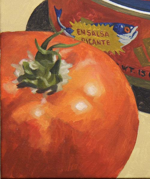
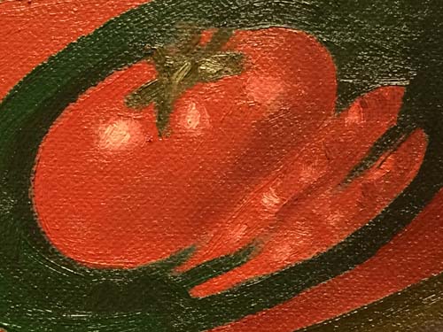
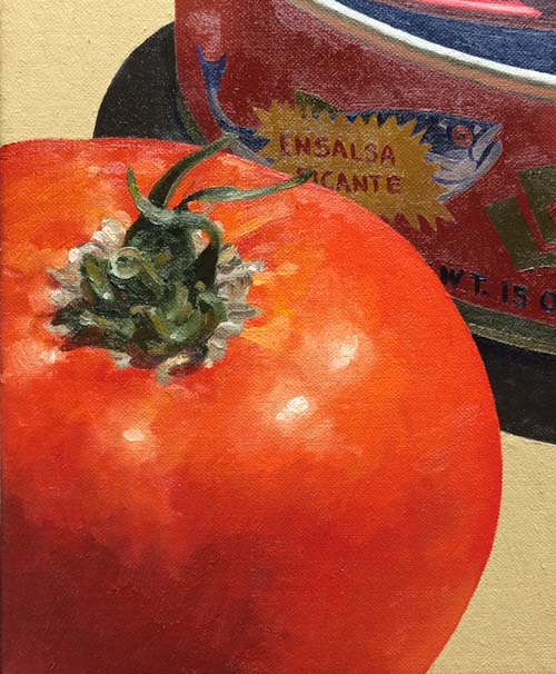
The tomato compliments the sardine can, helping to explain the
tomato sauce in the can...
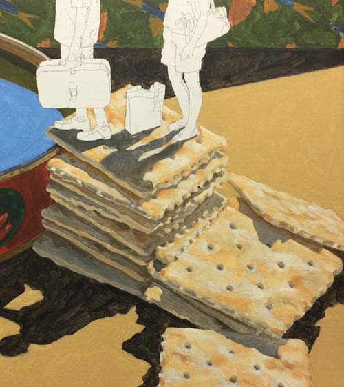
The crackers are a study in subtle value changes, showing the
lightly browned areas on the surface.
Rick and Cindy are atop the crackers, waiting for their turn to
fly across the ocean.
Here we are at the half way point in the painting. All
areas of the painting have been given their first passage of oil
pigment, albeit a turpentine thinned down layer.
The first area I'll work on with the final layer of oil pigment
is the back wall. The dark green area of the wallpaper
will dictate how bright the areas in the foreground will light
up. This contrast is a major contributor to the dramatic
lighting in the painting. Look above and see where I've
started applying the darker green (thalo green, burnt sienna,
cadmium yellow and black). The final value of this color is
significantly darker.
Here's a look at how this passage of paint affected the entire
painting. Even things that need to be subdued are forced into a
bright state.
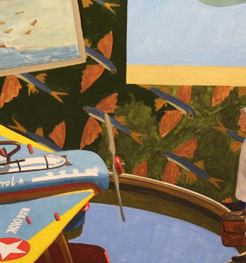
Mainly, when this dark green is applied, the rest of the
wallpaper pattern brightens. This shows me that the flying
fish need to be darkened so that foreground objects separate
from the background.
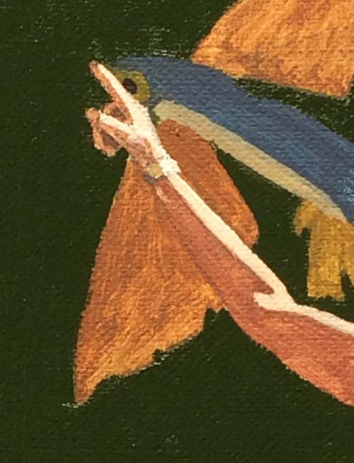
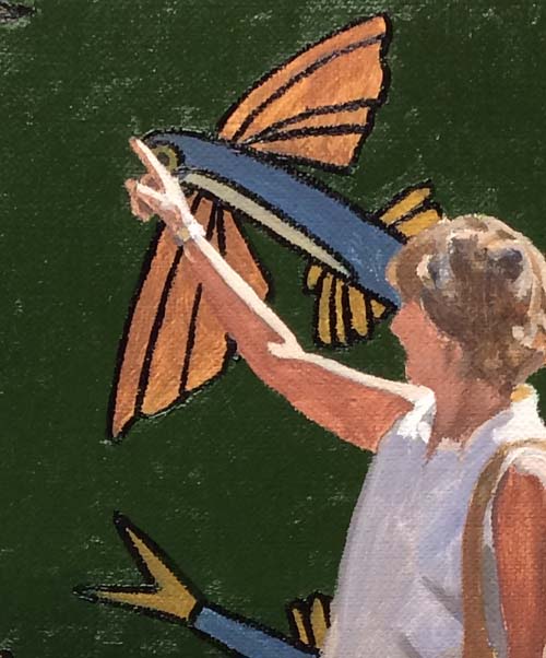
This close-up shows that the 'wings' of the flying fish need to
be darkened so that they help her arm lighten up. Right now, her
arm and the flying fish's 'wings' are the same value. When
I darken the fish, her arm will glow with light.
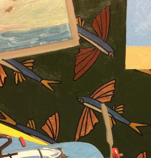
I've gone into the wallpaper design and painted the black
outline that defines the different parts of the fish.
This photo shows it a little better. The dark outlines
make the colors of the fish seem even brighter. I'll
darken those areas next.
You can see how much I am darkening the fish wings by comparing
the upper fish to the lower ones.
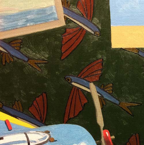
This photo shows all the fish with their wings, fins and tails
painted their final hue and value. The body of the fish will be
the last areas to complete.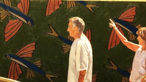
Here's a small chunck of the painting with the wallpaper
finished.
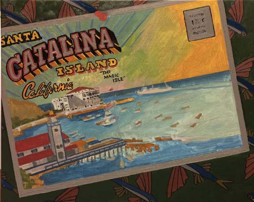
The postcard is way too light. This is very evident with
the wallpaper finished. In order to figure out how dark to
make it, I'll start with those areas of the postcard that are
white. I'll match the small white area of the fish's body
and then slightly lighten it. I've painted the stamp are,
the trim around the card and the inside area of the word
"CATALINA".
This detail shows how dark the grayed down white areas look.
With that in mind, I'll now darken the rest of the card to make
these grayed whites look 'white'.
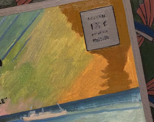
You can see that as I darken the yellow area of the sky on the
postcard, I've increased its value to a point where it is darker
than the grayed white areas.
The rest of the sky (minus the lettering) is painted in.
This photo shows the completed postcard.
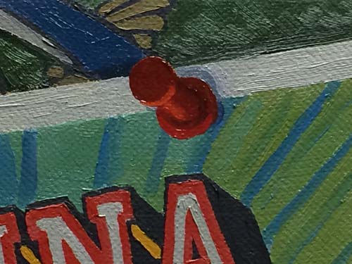
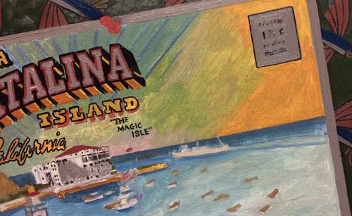
This close-up shows the thickness of the final layer of paint,
as well as the subtle values used on the pushpin. Notice
that the bottom of the pushpin has lighter accents, showing the
reflected light that is bouncing off the light struck areas
beneath it.
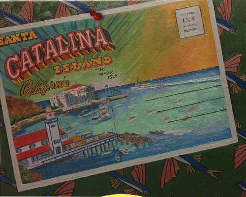
Another close-up, showing the ballroom on the postcard.
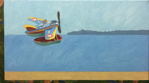
I've moved on to the window and have painted the seaplane in
flight. I've painted it lighter than the foreground
seaplane, which will make it appear further away, even though
the size does that also.
This photo shows the window view. I've added some
horizontal shapes in the water for interest and also given the
island some definition.
Sometimes thicker applications of paint can take away from the
reality (or surreality) that I am trying to portray. I
usually reserve these areas away from my figures, such as the
ocean in the window.
A very labor intensive area that I just completed was the
airplane in the sardine can. I'm attracted to the
lithographed surface of tin toys. They take many hours
with a double ought (00) round and bright sable brush.
Take a look at this close-up. You can see that there are
fine black lines around some of the colors on the tin plane.
This photo shows the water in the can. I've strengthened
both its hue and value.
The outside of the sardine can has been rendered with a few
adjustments in value.
Take a look at these two close-ups of the sardine label.
This is the right side of the label with the tomato and the
peppers.
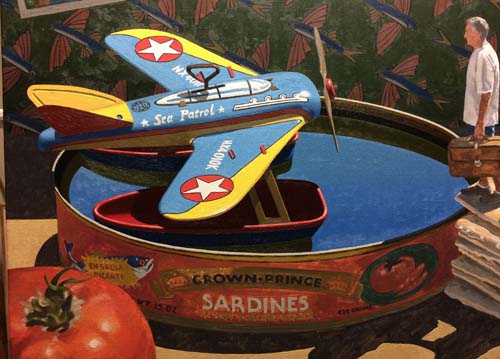
Here's a glimpse of the overall canvas to this point. I
still have to overpaint the tomato, the crackers and the man and
woman.
The tomato lent itself to being painted a little more
'painterly' than some other precise areas.
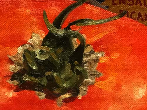
Here's a closer look at the stem.
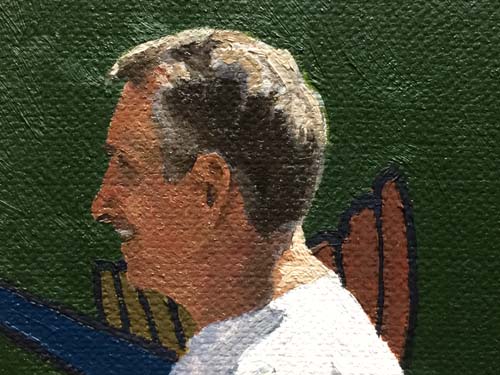
I've begun to work on the two figures. Rick's head is
finished.
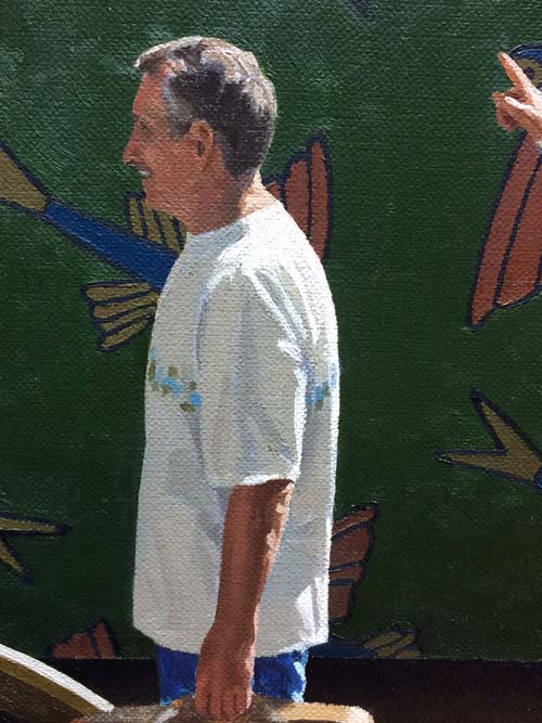
And now his t-shirt and arm are completed.
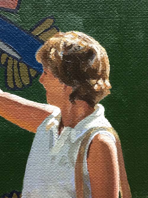
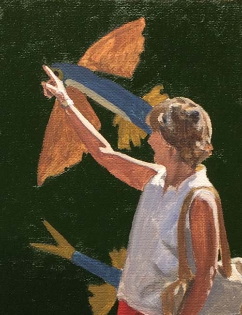
Cindy's profile is painted in with a few subtle values.
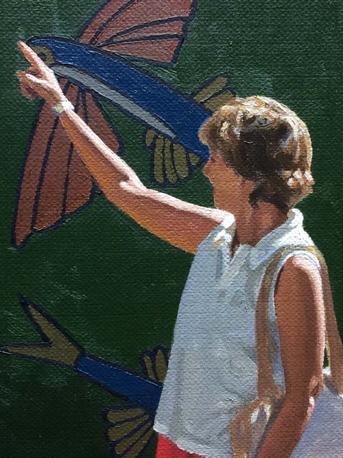
Both her arms and blouse are finished.
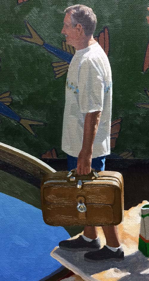
This photo shows the finished version of Rick. I
simplified his shoes, removing the sport pattern of the
manufacturer.
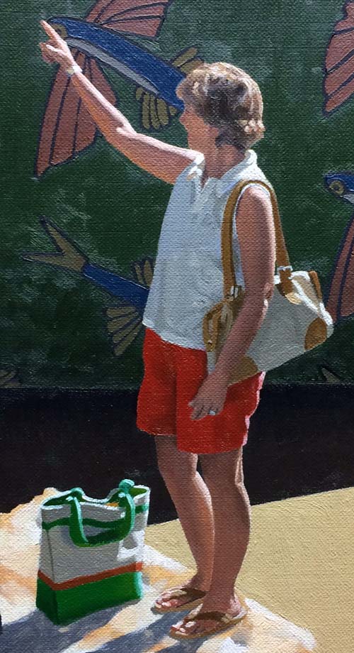
Cindy is also completed, right down to her flip flops and her
wedding ring.
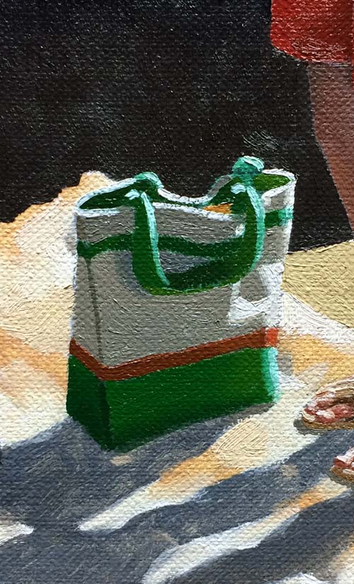
The carry bag is a study in simple shapes, with reflective light
defining secondary shadows within the sunless areas of the bag.
There is a little glare on the top portion of the photo, but now
you can see both figures just waiting for me to paint the
crackers and their cast shadows on the top cracker.
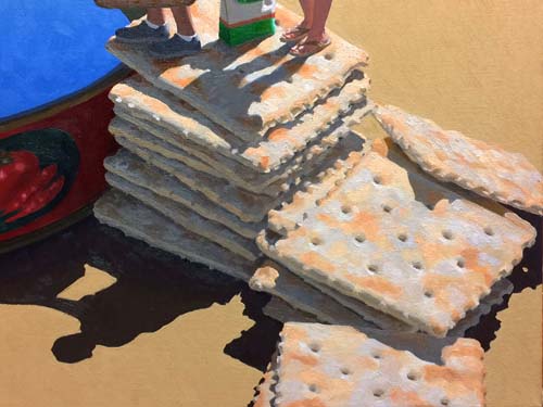
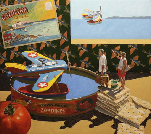
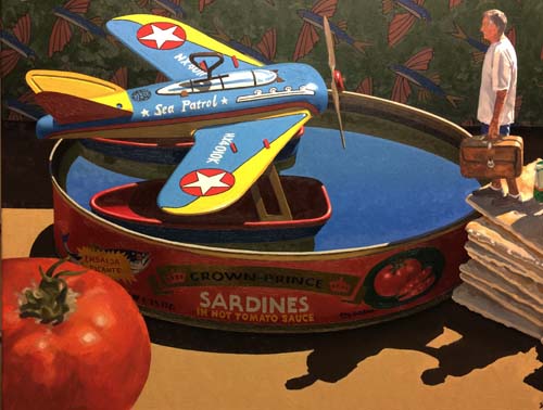
The soda crackers are the last items to be painted. With
that done, here is the finished product...
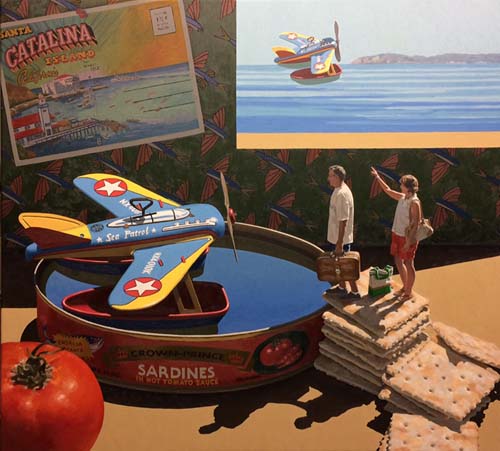
..."Flying Fish".
|